
;)
Pantone already know what colours you’ll be mad about in 2019


2018 may still be in its infancy but interior designers are always looking ahead.
The reveal of the Pantone Colour of the Year is always a major event, but the choice itself requires a long stretch of planning and elimination. While we’re all still hooked on 2018’s Colour of the Year, Ultra Violet, it seems that the colour experts at Pantone are already turning their attention to what 2019 might bring to the world of interior design.
Let’s take a closer look at what colours we will be falling in love with next year.
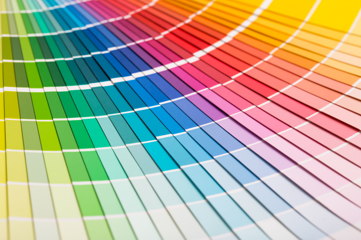
The PANTONEVIEW home + interiors 2019 collection
The latest collection from Pantone consists of 72 stunning shades, which they predict will all be right on trend in 12 months’ time. This vast spectrum of hues has been categorized into two completely opposing colour palettes: Cravings and Classico. While Cravings deals with warm, spicy tones, Classico is cooler and more subdued, meaning there is something for everyone across the two palettes.
These colours have been specifically chosen by Pantone to suit the world of interior design and homeware, and they consist of a healthy mix of tones. You’ll find colours that hark back to classic neutral décor options, peppered with exciting bold shades to whet even the most daring appetite.
Speaking about the new palettes, Vice President of the Pantone Colour Institute Laurie Pressman shines a light on the importance of thoughtful interior design.
Pressman says:
“With more choices than ever before, it is essential for home furnishings and interior brands and designers to connect with their consumers and deliver the themes, palettes and colours that engage and stimulate beyond the surface.”
Pressman also discussed the inspiration behind the collection, and her own personal excitement for the future. She says that the palettes are “inspired by the idea of focus — because of the infinite choices of our time and the need to hone in on those that capture roving eyes.”
She concludes:
“PANTONEVIEW home + interiors 2019 is a colour roadmap that is focussed on the colours that are leading the way towards a diverse, imaginative future.”
CRAVINGS
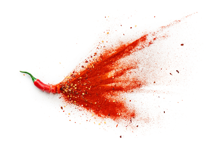
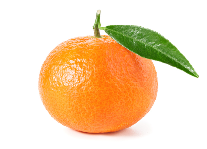
The first of the two 2019 palettes released by Pantone takes its inspiration from the plate, meaning it consists of a host of delicious colours which each bring a different flavour to a space.
These colours are designed to tempt both the eyes and the taste buds, so you’ll find a lot of hot, spicy red tones here, alongside juicy orange tones, flamingo pinks and rich, succulent purples. The collection is designed to be irresistible, finding inspiration in “fetish foods”.
However, it’s not all spicy within the Cravings palette. You’ll also find warm neutral tones which add a calmer edge to the collection, such as soft golden Butterum and earthy Cappuccino. There are also cooling respites in the form of grassy greens and some oceanic tones.
CLASSICO
Unlike the daring steps taken by the Cravings palette, Classio offers up shades which are designed to endure. The name says it all with the Classico collection — these are colours that have been picked due to their fundamentally everlasting nature, whilst still remaining elegant and fashionable. These are interior design choices which will never go out of style.
But like Cravings, the Classico collection is also extremely varied. You’ll find light neutral tones like swan white and camel tan resting effortless against deeper tones like burgundy red, grey flannel, deep teal and caviar black. There are also surprisingly bold shades to be found, such as apricot brandy and rich gold, perfect for accenting a space.
Put these shades to good use when you move to your dream home at Craighouse. Yet to discover our new development? Find out more here.