
;)
14 colour combinations that shouldn’t work but absolutely do


Thinking of sprucing up your property? Here are some truly bright ideas
We’ve all experienced the itch to transform the way our home looks and feels. After a while, your interior design stops having the impact it once had, and refreshing your décor is a great way to make sure you can enjoy your home environment again.
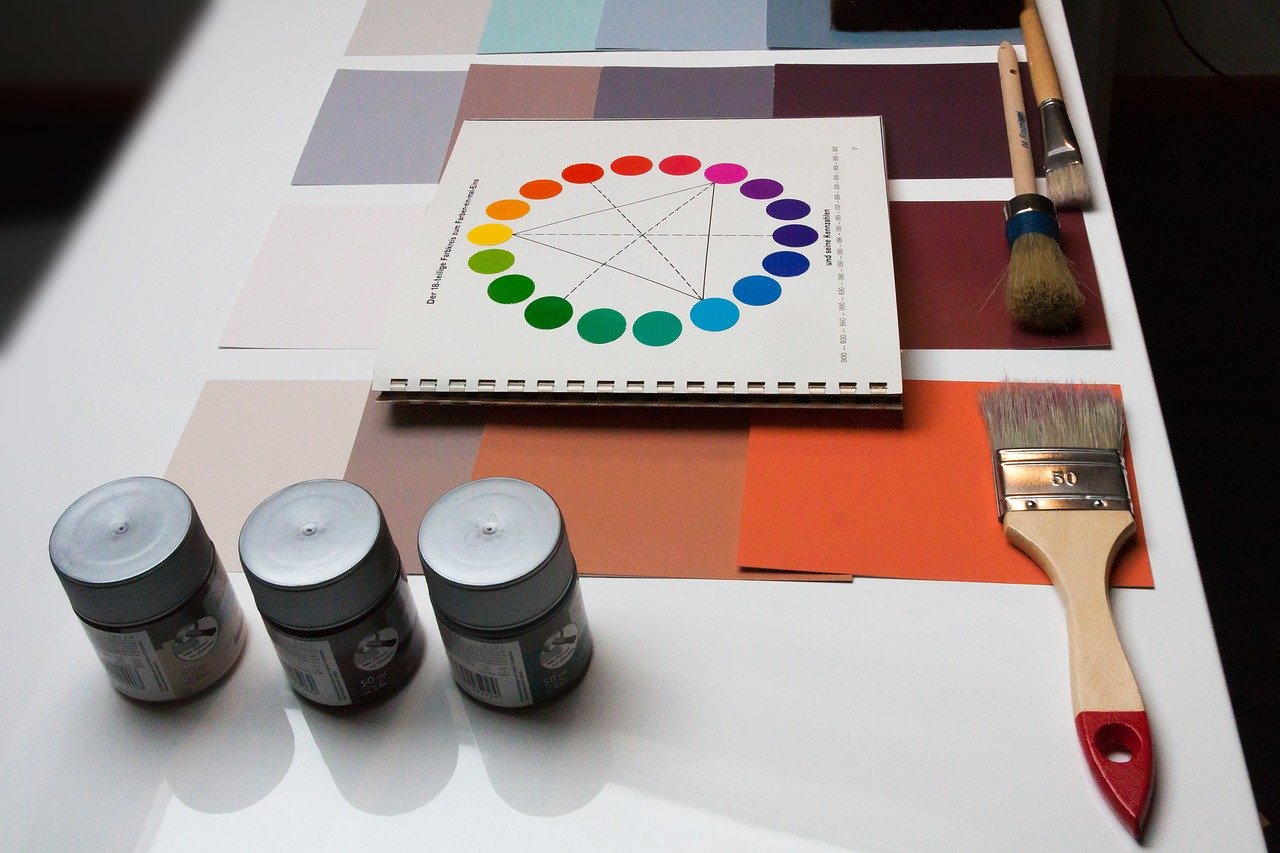
Colour is one of the most powerful tools at your disposal when it comes to interior design. Switching up the shades in your home can instantly give it a new lease of life, but choosing your hues is no easy task.
We’re often told to play it safe when it comes to colour, sticking to neutral tones and off-whites, but sometimes it pays to a be a little bolder with your options.
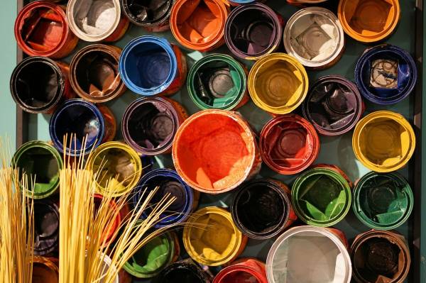
That’s why we’ve put together this guide to some of the braver colour combinations at your disposal. Forget whites and greys, these are the bright and bold colour combos that really shouldn’t work but absolutely do. Consider some of these as a way to make your interiors shine again.
Sapphire and mustard
Rich sapphire blue is a bold choice for your walls, but one which really packs a punch. Because blue is a colour we associate with relaxation, even the boldest shade doesn’t feel overwhelming. In fact, it can bring an elegant sense of luxury to your living space, while bright yellow or mustard accessories lighten up the room and bring an element of fun.
Aqua and raspberry
Aqua is another great option if you’re thinking of blue for your walls. Because it is paler and lighter than sapphire, you can afford to be bolder when pairing aqua with other colours. One daring option is a rich raspberry pink. Because both these colours fall on the cooler end of the spectrum, they work beautifully together Consider aqua walls with raspberry curtains or cushions for an exciting pop of colour.
Tangerine and olive
Orange is a colour most people tend to avoid when decorating, as it can be difficult to make it work without it feeling too bright. But tangerine is a great option as it’s slightly more subdued than the brightest oranges, making it more palatable. It also works surprisingly well with elegant darker tones like olive green. The combination of these two colours feels at once both traditional and really unique, especially when paired with bright leafy plants and fun wall art.
Blush and mahogany
Blush pink is a beautiful shade and a great option for anyone who doesn’t want to go too bold but still wants to avoid wholly neutral colours. Instead of choosing beige, white or off-white for your living space, consider blush instead to add warmth and a playing element to your home. What’s more, this shade works perfectly alongside natural woodgrains like mahogany. When used together, these tones create a quaint antique look which is hard to resist.
Mint and grey
When it comes to kitchens and bathrooms, we tend to stick to greys and whites. However, you can easily spruce up a grey room with a subtle cool tone like mint green. The combination of mint and pale grey feels fresh, clean and modern, giving the heart of your home a sleek edge which will help you get energised as you pour your morning coffee.
Yellow and white
Like orange, many people are scared of decorating with yellow because it’s one of the brighter, bolder colours out there. However, when used correctly yellow can be a powerful tool. No colour is more energising and more positive than yellow, so give it the spotlight it deserves by pairing it with a simple white. Yellow walls or accessories will help you create a fresh and sunny atmosphere.
Peach and black
Peach is one of the most popular colours in the interior design world right now, as it’s another shade which can act as a more interesting counterpart to typical neutral tones. We tend to automatically pair light tones with other light tones, but for a daring and modern vibe, try combining peach walls with a bold black trim. This will add a chic, formal element to a living space or dining room, making guests stop and take notice.
Teal and copper
Metallic tones like copper are great for capturing that much sought-after industrial look. Copper and other warm metals make a space feel hip and happening, but can sometimes appear a little drab if paired with the wrong colours, which is why teal is such a strong option. As a bright and energetic tone, teal is the perfect way to bring the fun to an industrial space.
Charcoal and burnt orange
Charcoal is a shade of grey which just screams luxury. It’s dark, it’s daring and it commands attention, which makes it the perfect option for anyone trying to create a bold and elegant living room, kitchen or dining area. Try pairing it with burnt orange accessories as a way of breaking up the monochrome without losing the sense of decadence.
Royal purple and seafoam
As the name suggests, royal purple is another tone which is widely associated with elegance and luxury. And because it falls beautifully on that line between true purple and blue, it works really well with other blue-spectrum tones like seafoam. This very mild green-blue tone is a great alternative to neutral whites. Consider using seafoam as your backdrop for your walls, then use royal purple as a way to add bold pops of colour that bring the excitement.
Crimson and ink
A lot of people avoid black completely when decorating. We’re constantly told not to paint rooms black for fear of making them feel smaller and duller. However, just as off-white feels warmer and more natural than pure clinical white, off-black shades like deep inky blue are far less severe than the real thing. Ink feels like an elegant and grown up option, and pairs perfectly with other rich tones like crimson read.
Lime and pink
Lime green is a fresh and cooling tone, while pearlescent pink is subtle yet chic. When used together, these colours create a graceful, elegant jewellery box of a room that shimmers and shines. Consider pearly pink walls and green seating in your dining room, finished off with an eye-catching centrepiece of pink flowers.
Deep green and scarlet
Sometimes, colours on the completely opposite end of the spectrum can work well together because the contrast is so bold. This is certainly the case when it comes to jewel tones like emerald green and ruby red. In an otherwise fairly neutral room, touches of elegant green and red can a modern and almost abstract element.
Fuchsia and pale blue
Paler blue tones like duck egg are great options for those looking to capture that ‘neutral but not quite neutral look’. However, if you really want to spice things up, try pairing a blue backdrop with bold fuchsia accessories. Even a single fuchsia item can act as a showstopping focal point.
Whatever your style, you’re sure to find your ideal property at Craighouse. This stunning development from Qmile Group brings history and modernity together in perfect harmony. Click here to see more or contact the team today by calling 0131 478 05 31.